Colour Notes: Building a Practical Palette
The Case for a Limited Palette
Limited palettes simplify decision-making and make colour relationships clearer. When working with fewer pigments, the interactions between hues and values become more visible, and mixing choices are more deliberate. A practical palette does not restrict creativity; it provides a coherent starting point that supports learning and consistent results.
Choosing a Core Set
Start with a foundation of versatile pigments: a warm and cool version of primary colours plus a neutral or earth tone. For example, a warm red, a cool red, a warm yellow, a cool yellow, a warm blue, and a cool blue gives a broad mixing range. Add a neutral like burnt umber or a gray if desired. The exact pigments depend on medium and personal preference, but aim for substitutions that allow a balanced mix of hues and values.
Testing and Familiarity
Spend time mixing all pairings to understand their tendencies. Create a simple mixing chart: each pigment across the top and side, with the resulting mixes in the grid. This exercise reveals dominant characteristics—some pigments overpower others, some shift toward mud quickly, and some create clean tints. Familiarity reduces surprises in working situations.
Controlling Value and Chroma
Consider not only hue but value and chroma. Some pigments are naturally darker or lighter, and some lose saturation when mixed. Practice creating value scales and toned-down mixes. A practical palette allows you to reach both high-chroma accents and subtle muted tones without introducing unrelated colours that break harmony.
Limiting for Specific Goals
Limit further when you want a cohesive mood. Using two or three pigments forces reliance on mixing and unifies the colour language. For observational work, match pigment temperature to natural light tendencies—warm light often favors warm reflections and cool shadows. In expressive work, select pigments that support the intended emotional range.
Practical Exercises
- Create small studies using only one or two pigments plus white to explore range and control.
- Make color studies of a simple still life with a restricted palette to learn how mixtures reproduce observed hues.
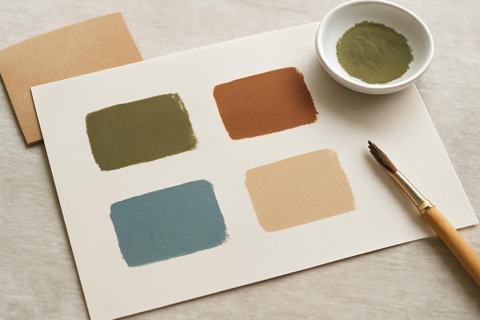
- Record preferred mixes with small swatches and notes so you can reproduce them later.
Working Across Media
Palettes differ by media. Watercolour and gouache behave differently from oil or acrylic. When switching media, recalibrate: the same pigment name may look different on paper versus canvas. Test mixes at working consistency, and observe drying shifts. Keep a consistent habit of swatching and noting ratios to speed future work.
Keeping It Practical
Resist collecting many single-purpose colours early on. Build confidence with a focused set and expand deliberately. A practical palette supports observation, mixing fluency, and purposeful restraint. Over time, you will know which additions genuinely solve problems and which merely increase complexity.
Colour practice is an inquiry: limited systems simplify questions so the answers become clearer. With patience and a small set of reliable pigments, you can explore wide ranges of hue, value, and tone while keeping visual coherence under control.